Tuesday, January 23, 2018

Lesson 14 (blocks)

Elements in html have a default display value: block or inline.
For text, one can see the difference between a blockquote and a span;
the first will appear in a new line, the second will appear where one puts it.

Here is the breakdown for some common elements:
Not all elements of the block type appear at the very left. Figure for pictures is
very useful in this respect:


source: W3 Schools

Not all elements of the block type appear at the very left. Figure for pictures is
very useful in this respect:


E Consumption

Hydro Québec is getting fancy: its latest client space
design allows me to see my electricity consumption
by the hour. Yesterday, for instance, the big surge occurred
right after my evening bath (usually between 7:30, 8:00 pm).
For the rest, it is hard to judge because - at this time of year -
the heating goes on and off at odd times. The temperature
itself is a roller coaster, and my daily totals show it.

Next summer, however, when the heating is down, every piece
of toast and jean wash will be accounted for!!!


                                             *     *     *

Today is a rain on ice day, and I'm having to admit to myself that I will NOT
be going out. Still, celery leaves on toast is a nice enough brekkie...

Monday, January 22, 2018

Lesson 13 (lists)

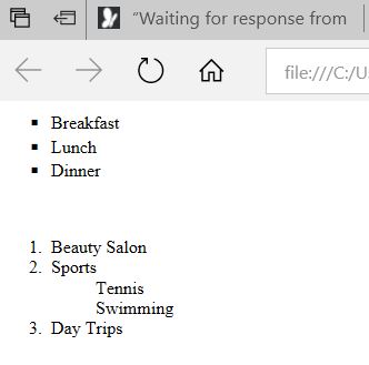
Html makes provisions for the possibility of showing
lists of individual items; these can be ul unordered (and
each item will be preceded by a mark of some kind) or ol
ordered (according to a choice of numbers or letters).
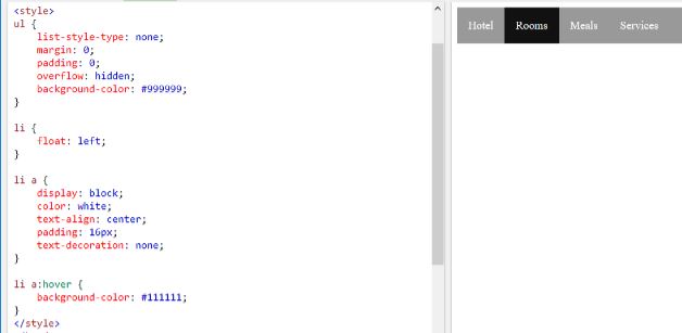
With proper styling, one can make a list that appears sideways
and - in a pinch - serve to make headings (with the float left
property on the li line tags) and it is possible with the dl tag
to design definitions, dt being the term, and dd the data... Below:


Once the list elements have become anchors, one just puts a onhover functionality on them.
In the example, this makes the background darken on the item the mouse is hovering
over.

source: W3 Schools

Sunday, January 21, 2018

Lesson 12 (tables)

Creating and styling a table is rather simple in HTML;
just make it visually appealing:
tr is table row; th is table heading, td is table data
tc is table column.
The table comes with a double line unless one specifies:
border-collapse: collapse.
Setting table-width at 50 % will reduce the width by half.
Column-span at 2 has made room for 2 phone numbers.
I added an extra box by adding a td tag pair and
leaving it empty.
On view 2, I changed the text and background colors with styling on td.
                            *     *     *
I'm actually thinking of creating a table of Coffee Houses with the premium
drink I could order when in Montreal: Small Cappuccino at one, Medium
Mokaccino at the other...I NEVER remember!...with calorie counts and
prices...


Saturday, January 20, 2018

Lesson 11 (images)

One needs to be very careful with images, because
things might show up differently depending on the viewer's screen
size.  The viewport element in the head section is recommended
to set the given at reference zoom 100% (and a phone screen
will scale down rather than cut).

That said, it is obvious that my background image is set,
and repeats on a larger screen. One obvious solution: an image
with merging edges...Another would be to use a (pale)  smallish
Snowboarder-type icon to create a background pattern...

Note that I was careful not to distort the orange by setting the width in pixels
and the height to auto. This is a shortcut when one doesn't want to do the
math from the actual image.


                                      *     *     *

And for those of you discouraged that I am not working on centering
things in my colorful page examples; do not assume that high color is
always where we are going. Wired magazine, below, has a great home
page, very minimalist, that loads fast. The high color moments are left to the
ads and lead articles!!!


http://www.canadaone.com/ezine/expert/expert_qa.html?id=101


                                       *     *     *
HTML5 offers us the possibility to offer different images as a function of
the size of the device being used.  The browser will check the minimum size standard
we have asked for each picture, and move down the list until a match is found.
The img at the bottom will auto-size as a last resort.


Friday, January 19, 2018

Workaround


 W3 Schools offers an exercise with the map feature in html
which - unfortunately - is not possible as such with some
browsers on my windows10 system; namely, Chrome, and Edge.
(Firefox works fine).It comes down to these browsers not recognizing
coordinates in an html command. There is a workaround.

I have created - with Inkscape, on a mac - a YUM backgound image.
I have then opened a PNG copy of this image, and put my food logos
on top in Microsoft Expression Design. Iknow the coordinates of my
logos because the interface tells me.

I am now in a position to use this creation as a jpg backgound image
for the body of my html. Thus, the program can create red triangles onhover,
and the user will be shown the calories...etc for each dessert choice.

A day in the life of a Web developer...


https://www.w3schools.com/TAGS/tryit.asp?filename=tryhtml_a_coords

Thursday, January 18, 2018

Lesson 10 (links)

The bread an butter of Web sites is, o f course, the
ability to move the user from one site to the other,
one page to the other on the same site, one spot
on the one page to another. This is done with the use of the
a anchor tag. The accessory href introduces the new
address; the link moniker is what one is free to style for
better navigation. Link is also used in the head section
tospecifythe type of style sheet.

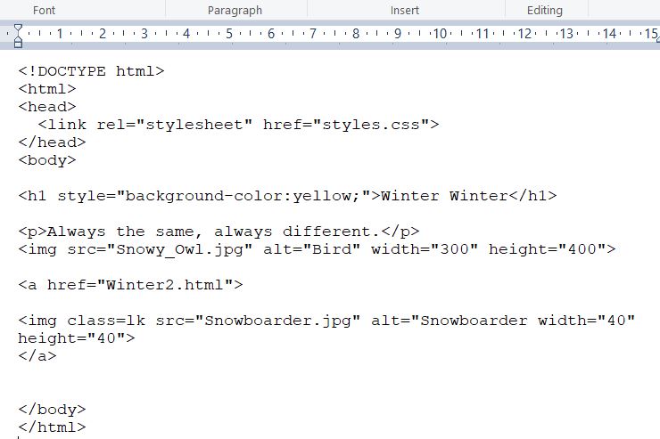
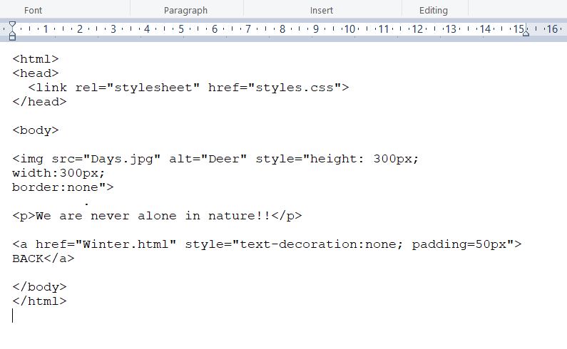
Below, I have taken yesterday's Winter code and added a link
to a second page, using the Snowboarder image (from the Windows
keyboard set) as the clickable element. Once on the second page,
one returns to the first with the Back link. I have removed the underline
form the Back ,which appears by default,
as does the arrow changing to a hand when one approaches...etc

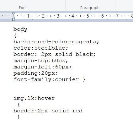
I am now using two html pages:


...as well as separate images for the Owl, the Deer and the Snowboarder, each in jpg format.


The result:

                                      
                                        *     *     *

I'll concede it: that magenta background is a little much; but at this
point the Web page is just starting to be defined, and we see clearly
what is going on.

Wanting the Snowboarder icon to light up when hovered over forced
me to get ahead of myself, and use the class construct. This is because of
how priorities are ordered in HTML/CSS. The styles sheet has priority over
inline styling unless the latter uses the Style construct. Since hover gets defined
in the style sheet, I had to identify the Snowboarder as an image used as a link,
hence of class lk. It was possible to just create a Javascript for onhover, but
I really want this to be true for all images used as links, if there are any!
This is why style sheets are so useful!!