Wednesday, January 31, 2018

Lesson 21 (responsive)

Certain layout practices make intuitive sense: giving
the actual width of an image as its max-width. An
unnaturally expanded jpg does look strange; the smaller photo is at max,
but the larger has been expanded from 500 to 800 pixels. One can see
the effect in the background gramophones.


image source: Bebe Rexha at the Grammy Awards, MSN
                                
                                         *     *     *
 Thus, using bitmap (non-vectorial) images in their original size
is really optimal. There are two strategies to take advantage of
this: the first is to switch images as the screen gets narrower using
a max-screen trigger; the second is to change orientation of elements
as a function of screen size. the code queries the browser as to the
size of the window.

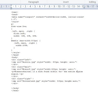
Below, the images will show differently, as screen size changes. Note
that text-size is a percentage of viewport...


Inheritance

One can amuse oneself with giving a child id to elements within a
flexbox container, and styling them as such, but stricto sensu, inheritance is
something else. A child element inherits all the properties and methods
of the parent.

The code below declares child elements by adding > to the container
class. (The asterisk * indicates 'all').

Browsers are showing some differences on my computer. Views 1 and 2 are with
Chrome, 3 Firefox and 4 Edge. I might add that Mac family computers need an
additional line of code with Webkit.

Getting fancy, one can specify different layouts once the code checks for the
dimensions on the user's device.


                                                           *    *     *
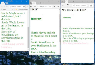
Aded a font size to ul styling, and made West pink inline. Below,
a comparison of what minimum width does: Chrome, Firefox, Edge.

The day is still young...


Tuesday, January 30, 2018

Lesson 20 (layout)

Designing web pages ie layout, has a history. Believe it or not,
the first Web pages with cool designs were done within tables. IT IS NOW
STRICTLY FORBIDDEN TO DO THIS!! Now you know.

Currently, mobile devices are the thing, and large parts of
the world are connected through phones. So that emphasis is
on what is called responsive web design, with pages that scale up
and down and where vital content is always available. Emphasis is
also put on fast loading. So that design is fairly minimalist.

The Golden Age of web design is neither of those, but it is the
most interesting. And one learns skills that can serve other purposes,
such as game development. Below, I have used the W3 Schools example,
using the properties float and clear, and built up on divs. Float (either
left or right) makes the element place itself automatically. Our  navigation
function has a maximum width, and because it is on the left, will always stay
the same regardless of the width of the screen. Specifying the clear attribute
for the footer means it will not appear on top of anything, but will disappear
(user turns the phone, or tablet...).This is conventional web design.


                                          *     *     *

New with HTML5, the flexbox allows elements to move and resize more
easily with the use of a flex container and its children elements. Below, we
see how the wrap attributes works, but there are many others... The elements
will place themselves differently as the page width shrinks!


Freedom

For us in America, the freedom continuum is clear:
slavery at one end, and liberal democracy at the other.
And the vague rumble of European History in the middle.
But our situation is unique - we have known slave/workers in modern
times - and we have witnessed their emancipation. Yet ours is a very
particular case. And parading our modern values words as the summum
others are failing to reach might well sound disingenuous to them.

And yes, folks from elsewhere like nothing better than to move to a Liberal
Democracy when they can, but what they want might not be so-called freedom
of the press, but the move to a different legal and economic framework,
that the exploitative one they are leaving makes possible. Let's look at it.

Slavery and serfdom are not the same thing. Serfdom grew out of the Roman
system of colonii, binding agricultural workers to a villa, so that agricultural work
could get done in a predictable way. A serf is not a thing, but a legal entity with some
rights, usually with respect to other serfs. The land he works is his tenure.
By the Middle Ages, the separation of labor it represents is clear: the lord
of the manor - or the knight above him -  ensure military protection, and the serf provides
labor in return. It is only once war becomes the work of conscripted armies -
when serfs are expected to fight in endless territorial wars, under atrocious conditions and
often in the face of sure death, while the aristocracy parties on -  that serfdom becomes
unendurable, in effect, worse than slavery.

This was the situation in Russia, and it is also why democratic reform was the wrong
puzzle piece in that context. And if the long emergence of Parliamentary Democracy
was the work of Britain, universal male suffrage was first declared in France, at the
time of the French Revolution.

America is referred to - in the European press - as a land of immigrants (un pays
d'immigration massive). That might make us loud, and volatile, because we all have
emotional ties to elsewhere. And American history is one of progress because there is,
or was, always new land and resources. It is today a place of technological advance,
and great tolerance, and might do well to show that face to the world.


Monday, January 29, 2018

Slice (Javascript) & Lesson 19 (head)

When getting user input with JavaScript, one needs to use
an entity designed to facilitate the job such as a prompt or a form.
Just lifting text can be tedious. Below, I want to get the name of
the person in the red dress for the photo: I have to create a variable
with a slice ie pick up the letters of the name...


photo source: MSN

                                     *     *     *

Below, the blog as seen on a mobile phone (iphone6/7), with Screenfly.
I set the screen to horizontal, and allowed scrolling.


                                         *     *     *
And just to see what the 'test your code' issues are, try Screenfly with the following:
http://quirktools.com/screenfly/
https://www.candywarehouse.com/dark-chocolate-kit-kat-candy-bars-24-piece-box/

                                      *    *     *

  Going to Mozilla Developer Network, one can find out a few useful things
about why the head section, and its meta tags,  are important:
- specifying that the character set is utf-8 means that foreign characters -such
as Japanese - will be rendered;
- adding a title to the document will give the site a name.This name will appear
on the browser tab, and will be the suggested name for an addition to
favorites;
- 'name' and 'content' can be used to store the name of the author;
- keywords are no longer used, but looking up Search Engine Optimization
will yield suggestion on information that might interest browsers;
- Google Webmaster Tools will provide Analytics;
- It is a good idea to specify the language in which the site is written.


Sunday, January 28, 2018

Lesson 18 (file paths)

We have a situation, here. Normally, I know
what to do to open an image file from an html
call.
<img src:"MyPictures/Bird.jpg" >

But what happens if the calling html is in the folder and the image
on the desktop ie the caller is one down from the image.
It turns out there is a certain way to do this.


VoilĂ : I have indicated that the bird image is one up with ../
(For recall, file systems do this by inverting the direction of the slash\).
I would use ../MyPictures/HappyB.jpg if the Bird ios in a MyPictures folder and
my html is in a MyCode Folder ...I still have to go up, then down.

The limiting case occurs when dealing with the root folder;
one just uses /Nameof. This would be the case for the 'index'
folder of a web site.

                               *     *     *


Saturday, January 27, 2018

La Seine in Paris

Drone film (police footage) showing the current level
of flooding in Paris. The peak - 6 meters, as opposed
to the normal low of 1,2meters - is to be reached Sunday night...


JavaScript (cont'd)

Some useful things to know about JavaScript:
The styling name conventions are not identical to those of CSS;
one needs to use camel case directives ie 'backgroundColor'
and not background-color!! Javascript predates CSS.

It is possible to change a string to a number. By default,
everything is a string, but if one adds the + operator, it
will behave as a number.( Other operations will happen
as expected).

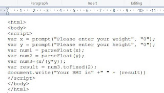
One can parse input from the user, as with the BMI code
below.As always, the devil is in the details, and one needs to
worry about decimal places (enter numbers in metric).


Friday, January 26, 2018

Lesson 17 (JavaScript)

JavaScript is the programming language that allows one to
interact with the web page. The example below adds a button that
turns our phone on and off. It is also useful to the developer,
who can use it to check if certain events have happened, and
create a script that reacts. The second version of our phone sends a ring alert
once the page is loaded.

It is customary to have the actual script in the head section, although an
onload script might also find itself in the body of the code. Scripts are
functions, in the tradition of C languages. The function name is followed
by brackets with the input conditions (or none), and the action to be performed
is within curly braces.


source:Phone and Cat are from Google images.

                                                  *     *     *

source: Wikipedia
                                                *     *     *

http://eloquentjavascript.net/

Thursday, January 25, 2018

Lesson 16 (iframes)

It's -16°C this morning, and my spirit is broken: I want
cake for breakfast...
                                *     *     *
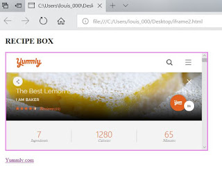
iframes are a powerful html feature: they allow one to show
a Web page within a Web page. This is perfect for my Recipe Box
food site; I want to be able to refer the user to a tasty recipe on
another site.

There are two versions of the code for this. The first simply opens
a site showing a page from another site within it. The second version
- more likely - forces the user to click on the site for it to appear.
It makes use of the targetproperty. (Specified within an anchor tag,
target:blank will open in a new window...)
source: W3 Schools


Wednesday, January 24, 2018

Lesson 15 (classes)

Html classes offer a handy way to style all similar referents
on a web page. If one wanted to show all headings in red on
a page, one could define a style for headings in the head section easily
enough; but if wanted to make appear all city names on a page about
Portugal, one could create .cities class and mark our cities with that idea.
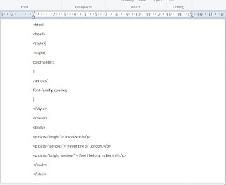
And because one can specify with finer detail by using two classes at once,
one could show main cities as belonging to two classes, .cities and .main,
and therefore in bold and red. And in a complex web site,
divs might  belong to certain classes...etc

What the class does is defined in the head section, within the style brackets,
after a period and the class name. We are between two curly braces, and there is
no need for quotation marks. Attribution is done with a colon. (As is the
case for ID, meant to be used incidentally).
                                        *     *     *
One can alter styling using classes and javascript. The example below
is interesting in that it uses the CSS Display property, which governs layout.
When I hover over Moscow with the mouse, it displays as a block element
and no longer inline with the text.