the actual width of an image as its max-width. An
unnaturally expanded jpg does look strange; the smaller photo is at max,
but the larger has been expanded from 500 to 800 pixels. One can see
the effect in the background gramophones.
image source: Bebe Rexha at the Grammy Awards, MSN
* * *
Thus, using bitmap (non-vectorial) images in their original size
is really optimal. There are two strategies to take advantage of
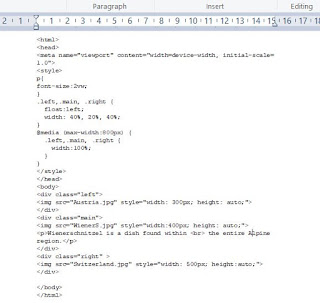
this: the first is to switch images as the screen gets narrower using
a max-screen trigger; the second is to change orientation of elements
as a function of screen size. the code queries the browser as to the
size of the window.
Below, the images will show differently, as screen size changes. Note
that text-size is a percentage of viewport...


No comments:
Post a Comment