some sort of animation effect on the border...
Take 2:
Image candidate:
* * *
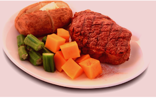
The above steak image now has a hue the same as that of mock-up2. Here
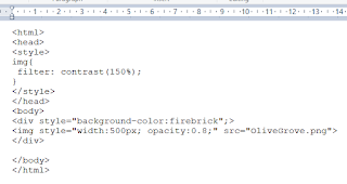
is how this was done.The example below is an olive grove.The roginal
picture, on the left, was a little washed out. I upped the contrast to 150%.
I then reduced the opacity of the image to 0.8.The result is the original
image,only this stime,it is transparent and will take on the hue of the
color behind. So I put itin on a firebrick background. Voilà.
* * *


No comments:
Post a Comment