transition that occurred in layout design when people left desktop
computers in favour of laptops and phones. The 'fixed' position needed
to be rethought, because elements that are fixed make no concessions.
Absolute is with respect to the parent element, and that is more sensible.
This is what the bottom nav bar does in the W3 School example, initially fixed
(on the bottom, no matter what) it becomes fixed to adapt to resizing. It
thus becomes 0 left and 0 right.
It should be noted as well that three equal signs are used in the function to indicate
we are looking for identity with "navbar".


I encountered considerable difficulty with how to show the wagtail picture. It is
counseled to use 100% width on content, rather than fixed numbers but, in this case,
that just produced a too large bird picture cut off at the bottom. So I resized the
image to be 500 px wide, and used the forbidden 'auto' for size. This is luxury, only
possible in special situations.


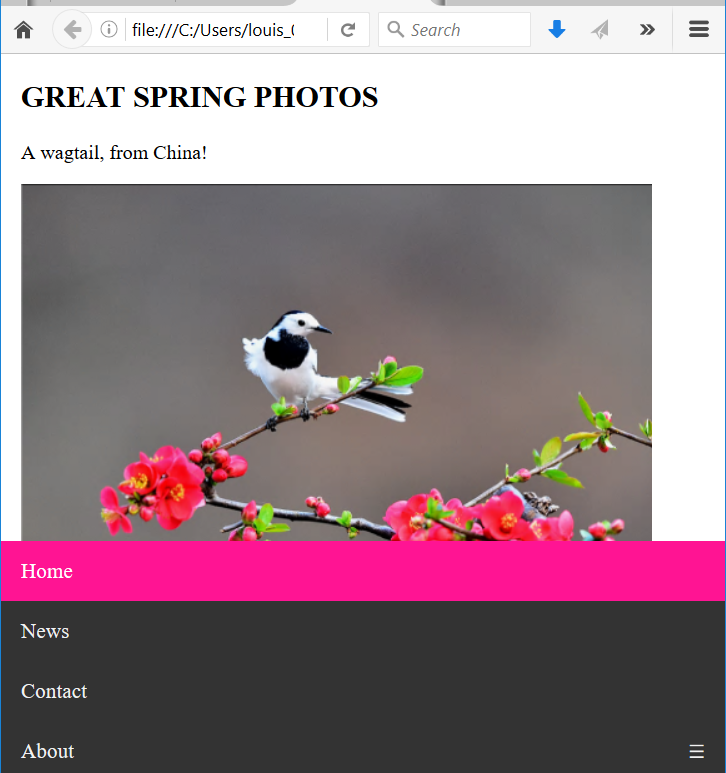


picture: from the Guardian UK
No comments:
Post a Comment