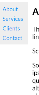
The next topic on W3 Schools is a left navigation bar; not the most
common arrangement, but perhaps useful on mobile. To appreciate
different styling effects, one needs to consider the default behavior of the
elements, and what changes this.
For example, specifying height for the side will yield a fixed bar, but
not doing so will also do this, only the bar will have a shorter height;
that necessary the otherwise defined elements.
The a anchor tag has a default behavior which will not
be displayed if one specifies color,a d background.
Finally, max-height is used to good end, because it enforces a 450px maximum, and
still provides for padding and readability.
overflow-x: hidden is used to disable the scroll bar functionality.
The code on sidebar with push is very economical: the main div acquires a width
on open, and goes back to margin zero on close.
I was also happy with the X to close the panel, which is just an X well placed with
javascript: void(0);
Below, in hotpink!!
* * *
For animation events on navigation, it is important to time things properly: side and
main need to both transition in 5 seconds. The color of the menu items changes in
3 seconds.
One creates full screen slides differently, depending on origin: from the side by
setting width; from the top with height; without ani8mation with display: 'block'.


No comments:
Post a Comment