and it is customary to place a container div underneath. This allows
one greater freedom to adjust styling later on; the body element is quite limited.
Below, the difference between container and bounding box. Content-box sizing is
the default.
One often needs to specify a clear property on a div: whether it will allow other elements
to its right or left.
Clear both means just that: nothing on the left or right, here of the container div.
Wanted a pale mauve as background, and with low opacity on everything! The container
is below the icon but the opacity setting affects the icon. Grr!
Our icon now has a thistle colored background!!
The body element will totally ignore a command to put width at 50%.
Our div container will maintain a margin. And with a border, will show color
above the icon...
Adapted from W3 Schools
For those in a hurry, W3 Schools offers the possibility of
referencing a longish predefined CSS style sheet. What this does
is allow one to proceed quickly with a Web page design. Below, I am on their page for
placing elements right and left, and merely changed the color on the left
to purple in accordance with their own color scheme.
* * *
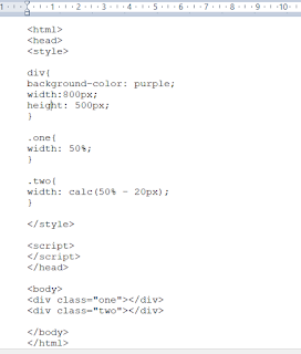
Was quietly looking at things in view of tomorrow's coding exercise when i
noticed something new: the Edge browser now does calc() calculations. Tested
it below:
Hoorah!


No comments:
Post a Comment